Monday, March 27, 2017

The Importance of Composition

I would argue that composition is one of the most important steps in creating a drawing. Just as a good essay is based on a good outline, so too is a drawing on its basic composition; the structure has to be right, or the shading and effects applied afterward will be meaningless.

Composition can best be described as the overarching shape and spacing of an drawing. It is not a finished image, but rather a part of a finished image.


Figuring Out the Composition

Composition should be established before any other process. It involves laying down loose lines that can be corrected if misplaced and whittled into the proper shape with further work. I always recommend starting from loose, almost careless lines, because they allow you to experiment before you commit to the final look of your drawing. Then, once you have settled on the basic shape of your image, you can start working on cutting in more and more detail — again working from large to small, broad to minute. I would also argue that this step should take up a large part of your time drawing, if not more than half of it. Ultimately, this is the most difficult part of drawing, because this is where you make decisions about perspective and shape.


Examples of Poor Composition

I thought about creating a new drawing for the purpose of this post but was met with two dilemma: I didn’t want to spend several hours working on a piece that would ultimately not look good (who does?), and I wasn’t sure the example I came up with would sufficiently demonstrate my point. After all, you can create a good image without first considering the composition — it’s just unlikely. Instead, I decided to use two of my own, finished pieces that I already know suffer from poor composition.

 Can be found on my DeviantArt page, here.


This is a piece I named “Vulture.” I believe it is currently my most popular drawing. It might have something to do with the crispness and color of the ballpoint pen versus the comparatively grainy look of graphite.

The first, most glaring issue with the composition of this piece is its lack of a background. This is actually a symptom of the lack of composition, and not necessarily my choice as an artist. Of course, a lack of a background is not always a problem in art, but here I felt that it was — I would have rather hinted at an arid scene with little shafts of grass poking out from between the cracks in otherwise the lifeless soil. I couldn’t add this, because the perspective of the image did not lend itself to an appealing ground plane. Without deciding upon the perspective first, I instead ended up with the vulture angled away from the camera where I would have preferred it had been turned to face it directly (the idea was that it could be guiding something to the right).

Can be found on my DeviantArt page, here.


This is a piece I named “Water Feature.” It features a gargoyle overlooking an abandoned cemetery. Fun fact about gargoyles: the term only technically applies to statues with spouts meant to serve as outlets for water; when these figures are only statues, they are referred to as “grotesques.” In any case, I spent a long time — as I usually do with these kinds of drawings — working on this piece. It took about twelve hours over the course of several months (I worked on it during my lunch breaks) to complete, and during that time the composition really began to bother me.

Again, I started with the gargoyle, and not the basic shape of the overall scene. This caused the perspective to fall apart once I did finally decide to add in a background (something I have been challenging myself to do, lately). The land is supposed to be below the gargoyle by tens of feet, but the perspective on the tombstones does not indicate this. Instead, I should have had the tombstone appear at a more downward angle, instead of head-on. Or, if I had decided to bring the graveyard up to the level of the gargoyle (to indicate that it was perhaps set atop a low-sitting crypt), it would have looked something like this:

I think that sits a bit more nicely.

Leaving the graveyard where it was and at the angle that it was, I created a huge gap in the image in which I couldn’t sensibly work with — the perspective of anything in this region would either have been tiny or invisible.

Or, you could say it's a really steep hill.  I'm not really sure.

This is what upset me most about drawing this picture. I had worked myself into a corner, when just a few more sessions of working out the composition could have lead to a more intricate scene.  I hope this post spares you from the same disappointment.


Friday, March 24, 2017

On the “How to Draw Something” Approach

In my introductory post, I described two methods commonly used to teach drawing. These were the “How to Draw Something” approach, and the “Practice Drawing This Something” approach. Today, I want to briefly examine the former in more depth.

In that post, I was rather brief with my description of the “How to Draw Something” approach. It is important to note that the word “Something” in that title is necessary to separate this approach from a much more general, often long-running “How to Draw” series of tutorials, that focus (as I did in the previous four posts) on the technical basics of drawing. This distinction is important, because I am really only addressing the specific, one-off tutorials that are often published by websites or popular artists. They focus on a singular, specific subject and ultimately demonstrate a single way of drawing it. To make this approach simpler to examine, I am separating this approach into two archetypes: Step-by-Step, and Annotated Demonstration. However, due to this simplification, I would like to emphasize that these are generalizations.


Step-by-Step

The Step-by-Step Method


I am sure you have seen this before. This method of tutorial is more popular for cartoon styles. Simple shapes are used to rough out the basic shape of the subject, and then the details are cut into these shapes. In creating the above image, I found it easier to work backward from reference than to begin the process by messing around with basic shapes.

This was the original.  I broke up his shape into circles, lines, and trapezoids.


What is interesting about this method, is that it very quickly approximates the first step of drawing that I showed in my first “Using Values and Gradients” post. The difference, however, is that the work of actually making these approximate shapes is already completed — your shapes, lines, and circles are all supposed to resemble those in the tutorial. I might make the argument that this is a bad habit for an artist, because they should learn how to do this on their own. But I suppose most of the people seriously attempting to learn something through these tutorials would have already figured that part out, so what do I know?

It seems logical to assume that this method of tutorial would only ever teach someone to draw a very specific subject in a very specific way. That was the point I made in my introductory post, and I believe it has some merit. I won’t say that this logic is completely reflective of reality, though, as it seems people have been able to use this kind of tutorial to draw many different subjects — at least, that is how it appears, because I can’t find any major criticisms of the method.

Other than this obvious point, I have two other criticisms regarding this method. First, I feel that this approach is intended for an audience that has little experience with drawing, yet it fails to provide an avenue for further learning; there isn’t much for someone following one of these tutorials to use as a basis for really exploring the things they want to draw. Instead, they are left to aimlessly play with the details added in the final step, because they do not know how to create the basic form of what they want to draw. The second problem with this method is that it enforces shape over value — instead of teaching a person to draw as they see, they are taught to draw as they think.


Annotated Demonstration

I wasn't sure how to draw this as a single, still image.


The annotated demonstration is a broader method than the “step-by-step” method, but its subject is still very specific. The tutorial essentially consists of an artist drawing something — using their own process — while they provide advice to the person watching. My “Using Values and Gradients” posts are an example in written form, though I like to think they could be applied more broadly than most of the tutorials that employ this method.

There are couple problems that I have with this method. First, I feel that it suffers from the same specificity of the “step-by-step” approach; the advice offered is usually only applicable to the same, or similar subjects. Second, there is usually a large gap in skill between the student and the teacher. While this is not always an issue, the student may find themselves either not understanding the advice being offered, or lacking the skill to employ it anyway.


Studying the Approach

Though I believe that there are problems with either of these methods, I feel that each has its place: no approach is perfect and universally applicable, or there would be no need for the vast quantity of learning material available today. Perhaps it can even be said that these approaches are hardly worth examining as an already skilled artist. But I like to look at these things as opportunities for learning — if not about the subject, then about the approaches themselves.

I have found a few useful “things” from the “How to Draw Something” approach, though I feel that I have personally outgrown its usefulness as it was intended:

First, from the “Step-by-Step” method, I believe there is something to be said about how this tutorial can impact an artist’s understanding of proportion. The simplicity of the first stages demonstrate a strong focus on making sure that the elements of an image line up properly. In the much more advanced study of things such as human anatomy, a preexisting understanding of the importance of proportion is definitely beneficial. Further, the basic shapes used in the first stages of these tutorials could also help an artist learn to block in more complicated shapes, if they are willing to experiment. And finally, the “step-by-step” method appears to work best in “reverse.” That is, working from a visible reference to make a drawing — instead of creating entirely new things from the mind.

Second, from the “Annotated Demonstration,” I feel that this method offers a potential wealth of information to a student artist provided they study the artist’s process instead of focusing on their advice. That is not to say that the advice should be disregarded, but rather that an eye for the unmentioned details may boost the helpfulness of these kinds of tutorial. In contrast to the “step-by-step” method, I feel that these types of tutorial may be better at helping artists create images from their minds.


 I have to say that this post is a little rougher than I was hoping, because I really generalized this approach to teaching. I may return to this topic some day to do it more justice. What is important is that it demonstrates a bit of what I am trying to accomplish with this place: I want to learn about art, and how to improve my skill, by examining the aspects of various subjects. In other words, I am not trying to be the person that follows these tutorials, but instead the person who looks at how artists do what they do — including those that made these tutorials.

Friday, March 17, 2017

Using Values and Gradients (Part 3) --- The Basics of Drawing


Welcome back!  It's time to finish this drawing.  In this post, we will be handling the textures and final touches.

Texturing…


From our last part, we continued to increase our contrast and cleared up some of the regions we had made. From here, we can create the texture of wood by laying down those really smooth bands on the wood. I did this by moving my pencil along the grain of the wood, and scribbled “up and down,” diagonally, to create bands that looked like a part of the wood. I tried to blend them into gradients as well; the image appeared to have the gradients move from darkest on top to lightest on the bottom, with a sharp cutoff starting the next band.

At this point, we can really just approximate the textures of the objects in our image. It is almost pointless to try to replicate exactly where each band in the wood is when we can achieve a nice resemblance by doing something easier.

Okay, so the bricks are probably a really freaky part of this drawing. How do we go about laying out those really uniform and small details on top of an already “flawed” and approximate base? (I was actually wondering how to do this while doing the drawing for this tutorial, heh.) Well, I came up with a decently effective solution, though I am sure it won’t work for everyone. Essentially I created a rough grid pattern on the light tone of the wallNow, bricks aren’t usually laid in a grid pattern, but are instead staggered. So I filled in the first cell on the first row, and then filled in two cells on the one below it. I kept a bit of space between the dark regions so that the mortar between the bricks was still visible. I continued from here with this pattern to get that recognizable brick look.


That’s About It…


A bit more darkening of the darks and finishing the bricks, and we are done. Well, you could keep going on into infinity darkening darks and tweaking the minute details, but honestly there will be a point when your image is satisfactorily done.

And hey, if it doesn’t quite look like what I was able to make, don’t worry. I’ve had a lot of practice doing this very thing. Just keep at it, and draw pictures of things you find more interesting than the outside of my apartment complex (unless that is interesting to you, for some reason). And if what you made looks even better? Great job! I’m sure you’re better now than you were when you started, if you felt like you needed to read this.

What’s important is that you take away these three things:
Draw lightly, and build up to darkness.
Draw with values, not shapes.
Start with a good base.


I hope that this is of some help to you; I had to make this into something of a quick-and-dirty teardown of my drawing process. Even then, it took a long time to prepare, and I did not cover everything that went into drawing this. That was a lot to learn and, if you stuck with it, good job. In any case, I will be moving onto some more relevant topics in the next post.


Monday, March 13, 2017

Using Values and Gradients (Part 2) --- The Basics of Drawing

Welcome Back!  In this post, we will be continuing with our drawing.  Today, we will be looking mostly at the midtones and values of the scene.

Working in the Mid-Tones and Continuing with the Gradients…


Now we are getting somewhere. What we want to do here is fill in those huge spaces of white with their respective values. Use comparisons of values that are next to each other to help you with this. I spent a lot of time with the grass on the downward staircase during this phase, because I wanted it to be light enough to be separate from the dark shape of the stairs, but dark enough to separate it from the closest part of that deck-platform-thing straight across the way.

Notice: we are not focusing on details right now, just the basic shades. Here’s definitely where being able control your gradients becomes a true asset.

I did jump ahead a bit with the forest, but the general process was the same. I filled in the base tone, and created some really deformed gradients to faintly hint at “leaves” versus “ground” (and really just noticed that a few of the tree trunks that really stood out). Remember those blobs from “D” in that above image? That’s how I created the look of the foliage beneath the stairs. I didn’t want to jump too far ahead, so I continued with this during the later steps.

The midtone gradients are a little more difficult to control, because they are fainter. However, they aren’t handled much differently from the darker ones: start from the darkest part of the midtone and move toward the lighter part.

I added a very faint value over the majority of the brick wall. This will be the approximate value of the mortar between the bricks. We won’t worry about the bricks just yet, though.


Finishing all of the Midtones and Preparing for Texture…


Now this is actually starting to look like a piece of artwork. We just continued to fill in those flat regions of value as well as the rest of those gradients. We are now ready to start looking into texture. I’ve continued with my jumping ahead on the forest at the top of the image; it is much closer to its finished state, and the darker regions I was trying to define are a lot more evident. Again, they are really just another step down on the gradient from the region that surrounds them, and they barely follow any real pattern. The randomness is what helps them look like leaves over top of those straight regions of light that made the tree trunks.

The only other part of the image that has anything resembling a deliberate attempt at texture is the window at the top right. Again, this followed the basic regions of shading visible in the image.

What is important to note here is that we are still being very loose with our shading.  We are not trying to pencil in very tight and perfect rectangles of specific values.  It's more like we are trying to scribble darker and darker patches over the regions we have already defined.  We can tighten up the edges of the really dark regions by going over their edges a few times with a few firm strokes until we've straightened them out  — just don't push too hard, or they will look darker than the region we are trying to clear up.  Doing this as well as darkening our darkest values is how we can increase contrast in our image.


Alright, we're doing pretty good here.  In the next post, we will be finishing this drawing with textures and some polish.  See you then!

Friday, March 10, 2017

Using Values and Gradients (Part 1) --- The Basics of Drawing

So now that you know how to make gradients, it is time to put them to use. The best way I can demonstrate how to do this is to show you how to copy a photographic reference. Now, I had originally intended to start with something smooth and simple — a single subject, like a vase — that would demonstrate large regions of value that are relatively simple to recreate. Two things precluded me from doing this, however: I could not find a subject that matched that description outside of my apartment, and the inside of my apartment is notoriously dark. I thus enacted plan B: take a photo of something that had a gradient and use that. As such, the image I would like you to draw is this:


Now, you are probably thinking something along the lines of, “you want me to draw that!? I just learned how to make gradients about a week ago!”
He's certainly thinking it.

Yes. And I really think you can. Of course, this "lesson" will follow my specific process for achieving this, and it may not entirely work for you. I hope that if nothing else, you will be able to discover your own method by trying to draw this picture.

But first, two things.  This picture is complicated, and it is a little too large to reproduce in its entirety just for the purpose of practice. We will focus on this region here to make this a little more reasonable:


Since I am not covering the subject of color this early on (I lack a reasonable amount of experience with it, myself), I will “gray-scale” the image so that we only have to focus on its values.
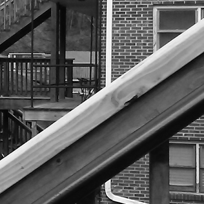
Open this image in another tab so you can look at it without any distractions, or download it to your computer and use some kind of image-viewer.  I don't really care what you do with it, nor do I care about you trying to copy it (obviously).

This last image will be the “reference” for your drawing. Believe it or not, it does have two characteristics that I think make it good for practice. First, it contains a few regions with really clear gradients. Second, it lacks a bit of familiarity due to it being cropped — this helps with ignoring the “shapes” of objects, and instead leads you to focus only on their values.

A few final notes before we begin. First, this image took me roughly three-and-a-half hours to reproduce. That might not be very relevant as you may be faster or slower than me, but I figured it would be worthy to mention in the event that you want a rough estimate for how long this can take to do. Second, I used only one 0.7mm HB-lead mechanical pencil to do this. This is the regular kind that you can buy in cheap packs at most retail stores. It is my favorite drawing tool, the one with which I have the most experience, and also one that you probably have lying around somewhere.
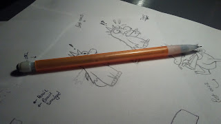
This, right here.  I think its technical name is the "BiC Sparkle, of the orange variety."  Definitely high-end art school stuff.


If you don’t, any regular, wooden pencil will probably work for this. I don’t recommend working with ballpoint or cross-hatching with an ink-pen, because they don’t function in a similar enough way.

Third, you will need to be able to “bend” your gradients, or make them fit various shapes. I didn’t figure that this needed any additional explanation in the last post because it really is just the same thing, but instead of using a rectangle, you are using curves. Further, you will need to be able to control how quickly your gradient “falls off,” or the distance between dark and light values. Also, you will need to be able to recognize the sharp boundaries between large regions of flat value — or, worded less pompously, just be able to fill in a space with one value and a different space with another. Finally, when shading, hold your pencil further back in your hand than you would while writing, so you can make broad, sweeping marks. Remember to draw lightly.
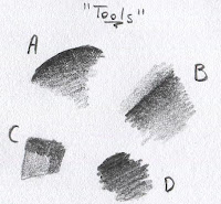
A: "Bending your gradient."
B: "Falloff.  The top has a sharp falloff, and the bottom has a dull falloff."
C: "Regions of value.  I won't believe you if you say you can't do this."
D: "A blob-like shape that will come in handy when I try to describe the way I make some of the texture much later on."
And this is how you should hold your pencil when shading.

It looks wobbly and imprecise. It is, and that is kind of the point. It takes advantage of how your wrist bends to quickly lay down long sweeps of the same value.


Setting up your scene with guiding lines.


Alright, now we can start. The first part of my process is to lay down some guiding lines.


This is one of the most important things we can do to start a successful image; no amount of skillful shading or detail will save a drawing made on a poor base. That is what this step establishes: a base for the rest of your drawing. This stage gives you an idea of what the final image will look like.

The way we can create a good base for this image is to start from the biggest, simplest shapes and move inward. Remember to keep an eye on your reference for the majority of the time you are trying to draw it; a lot of the skill of drawing lies in how well you observe your subject. Now, you are probably wondering what the difference is between these and outlines.

Yeah, I figured.


Well, outlines try to divide scenes into individual elements. You would use them, for instance, to separate a character from a background, or parts of a character from other parts of that same character (like, the eyes from the head). They also tend to be very bold, and stand out as a part of the final image. The problem with looking at these as outlines, particularly as a beginner, is that they invite you to draw a shape by the way you think it looks, rather than by the way you are seeing it. In this image, we are not drawing a banister, apartment building, and numerous complicated systems of railings. Instead, we are drawing shapes that will eventually be an illusion of these things. This is an important point; drawing is all about approximation. The closer your approximation is to an image of these things, the better of an artist you are (in an extremely rough nutshell). We should lay down these lines by looking at divisions in contrast, rather than the implied shape of the object. A good example of this is the line near the center of the image — the one that intersects that broken-out knot of wood. That region of our source image is black. Rather than trying to just outline that blob, I created a line here that would serve as the blackest part of my gradient. We can start our gradient along that line, and bend it into the knot to create a more realistic shading.

This part might give you an idea of what outlines really are: the divisions between regions of value in a way that symbolically represents an object. A lot can be written on this topic, and I plan to later.

You can use a ruler to make these lines, though I find “tracing” the red line on a lined piece of paper to end up looking more natural. The important thing is that you draw as lightly as possible! You will want to correct any major flaws in the composition of your drawing during this stage, so you won’t have to later. Spend a good amount of time on this stage, look at where these regions intersect the edges of the image; I started with the banister in front by looking at where it touched the edges of the encompassing square. Notice that these lines are pretty loose and “sketchy.” That’s something I encourage, because they allow you to play around a bit with the shape later.

A final note: I just used lines to represent the metal pipes that make up the railing on the other deck.

I spent about forty-one minutes on this stage to get it to my liking, though it might not look like it.


Starting the Gradients…


Okay, so we finished our lines and now we’ve moved onto starting on those gradients. Here is really where those lines really start to show their usefulness. I usually start with the darkest parts of the image. We won’t work these areas into a jet-black just yet — we can do that as we continue to draw. The biggest reason that we are using this image is actually apparent in this step: the black-painted metal of the pipe on the banister is a dark region with a very apparent couple of gradients. Once that pipe hits black, we can just shade all the way down to the bottom of that old guideline with a dark black.

With the pre-established guidelines, we can be sure that where we are starting these blacks is pretty much correct, and we will not have to erase them later. If you lay them on lightly, gently building up layers, you should be able to “nibble” into them with the eraser, though. The supporting piece of wood near the bottom right of the image is a good example of what we are trying to accomplish during this step: darks and a little bit of midtones to start off our work on shading this entire image.

Alright, it’s not very impressive yet, but we are getting somewhere. What is important is that we are working very roughly, and loosely; look at the downward staircase in the middle-left of the image. Those lines do not look like they were put there with careful planning, just controlled scribbling. This is what we want. We can come back later and straighten these out once the gradients and values are in place.


Wow, this post has started to get a little long.  I hadn't initially planned on splitting it up, but this is turning into a bit of a beast.  If you're still with me, great!  Hopefully you will have a picture that you are proud of by the end.  If not, well, keep practicing and I guarantee that you will draw better.  In any case, I will post the next two parts very soon.

Friday, March 3, 2017

Value --- The Basics of Drawing

These are the absolute basics, meant for absolute beginners— so this post will likely bore you if you are even a little experienced with drawing.

Drawing boils down to value. Okay, there is a bit more to it than just value, but those things are secondary to the fundamental success of a drawing. This is particularly true for attempts at realism. The reason for this is that the eye does not perceive shapes. Rather, it perceives values and colors— made possible by the two kinds of cells in the back of our eyes. Our eyes are complicated sensory organs with many other fun characteristics that might be worth writing about later (such as the “macula” and how it is our center of focus), but for now let’s focus on the very basics.

This should make some degree of sense; objects in real life do not have outlines unless they have been manufactured to look that way (and even then, they don’t have “real” outlines).

See: No Outlines

Value, for those of you that may not know, means how bright an area of an image is. So, to start learning to draw, you need to look at your subject matter as separations of different regions of value. To actually draw these values accurately, you need to be able to draw a gradient— or a smooth, wide transition from as dark as you can draw to as light as you can possibly draw. For example:


Here’s my best attempt at a gradient on paper using a mechanical pencil with HB, or standard lead.

This can be hard to accomplish if you are just starting out. Keep practicing, because you will be able to make your drawings more realistic when you are able to produce a wider range of values. You should also experiment with things, such as smudging the gradient to help the values blend together better.


That's a little smoother.  Maybe.

The method by which you go about making gradients really depends on the tool you are using, but every artist employs some method of making them in their work. I will discuss different tools in a future post, ranging from the mundane to the most advanced that I have experience with. For now, here are the three that you will most-likely be using.

If you are working with pencils, try drawing as lightly as you can. In fact, you should always draw as lightly as possible when you are starting a drawing so that you can erase any mistakes you make. Everyone probably remembers a time when they “engraved” a bunch of dark outlines into their pages and then were unable to erase them when they realized they had messed up. Drawing lightly prevents that.

Damn it.  Now he's got a ghost limb.
If you are using a pen, you can try to do the same thing that you would do with a pencil (this really only works with standard ball-point pens), or you could try any number of different methods of dithering. “Dithering” is the technical term for blending two different values or colors together by using one inside the other by different amounts. This will make sense in a minute, if you are lost. Two of the most popular methods of dithering with a pen are hatching and cross-hatching. Essentially, you are using lines to put down more ink onto some parts of the paper than others. In the case of hatching, you are only allowing your lines to move in one direction.

Like so.
And in the case of cross-hatching, you are using different angles of lines to fill up the space. Cross hatching tends to both approach total darkness more quickly than the other methods as well as create more visible divisions between lighter and darker values


Like this.  My hatching gradients leave a lot to be desired.
The theory behind either method is that you really only have two colors: the darkest black, and the brightest white. Without being able to produce grays, you have to trick the viewer’s eyes by varying the amount of black that appears in a region on the page. At the left of my gradients, you could say it is 100% black - 0% white, and then it moves right until it reaches 50% - 50% in the middle (though I didn’t do the best job at this, heh) and 0% - 100% on the far right.

If you are working digitally, it will really depend on what you are doing and what program you are using. My advice for now is that you avoid using any preset “gradient” tools. These can be great for wide, smooth areas that need a little bit of differentiation, but they can scarcely be used to create the complex regions of value needed for realistic drawings.


Okay, that may have been a lot to learn in the very beginning. You can make gradients now!… But how do you use them? I’ll show you in a near-future post (probably in the next barring any noteworthy developments). And if you are already experienced with drawing and would like to skip the basics… I’ll be getting that more relevant stuff after I cover some of the foundations of drawing. It just seems necessary.